Computational & Data Journalism @ Cardiff

Reporting. Building. Designing. Informing

  • Blog
  • About Us
  • Local
  • Guests
You are here: Home / Archives for Martin Chorley

DataJConf 2017

25th July 2017 by Martin Chorley

We’ve recently returned from a trip to Dublin for DataJConf 2017 – the first European Conference on Data and Computational Journalism. Our course directors, Glyn and Martin were co-organisers of the conference, along with Bahareh Heravi of UCD.

We first started talking to Bahareh about organising the conference sometime at the beginning of the year. We’d all recognised that there was a gap in the conference offering in Europe, with nothing really giving us a mix of academia and industry as you find in some of the stateside conferences. We decided that perhaps we could do something about that. We quickly found an excellent mix of keynote speakers, and our call for papers attracted a nice mix of academic and industrial talks, allowing us to put together a varied programme that was interesting to a range of people. We had over 100 attendees to the conference, coming from both industry and academia, which led to a productive two days of discussions, with the first day of talks followed by a day of workshops and an unconference.

We very much enjoyed it, and will be running the next edition in Cardiff in June 2018!


The DataJConf team

The DataJConf team


Filed Under: Blog

Our Alumni: Nikita Vashisth – cutting edge in India

22nd June 2017 by Martin Chorley

In our new series of posts we’re taking a look at some of our past students, where they’ve gone, and what they’re up to. First up is Nikita Vashisth, one of the graduates from the first year of our course in 2014/2015.

Two years after leaving the course, Nikita is working with a cutting-edge Indian data journalism team. One of the projects she’s  involved in is to measure air particles to help save lives in cities affected by pollution – something she initially proposed in her major coursework. Nikita said:

“I’m working as a data journalist at IndiaSpend, India’s first data journalism initiative. One of the projects I am currently working on is #Breathe, an air quality monitoring network. We’re analyzing pm2.5 and pm10 levels across Indian cities to understand city-wide high and lows. The vision of the project is to democratize data critical to saving thousands of lives and engage citizens and other stakeholders in a conversation towards solving the life-threatening issue of air pollution.”

And her view of her studies? Nikita added:

 “Being a part of the first COMPJ batch in 2014 was a whirlwind! I was introduced to COMSCI and it opened a whole new world of opportunities in journalism for me. The course takes a practical learning approach in digital journalism, data analysis and coding—which made it all the more fun. The Visual Communication & Information Design and Digital Investigation modules were especially engaging and lead me to understanding the power of data and design in effective storytelling. A big shout out to Glyn and Martin, my course directors/lecturers/mentors whose immense support and knowledge helped me get past the nerve-wracking learning curve by the end of the year.”

We can’t wait to see what Nikita gets up to in the future, and look forward to seeing the projects she comes up with.

Filed Under: Teaching Tagged With: alumni, data

Chatbots in the Classroom: Education Innovation Research

7th June 2017 by Martin Chorley

The Computational and Data Journalism team has recently been awarded research funding from the University Centre for Education Innovation to investigate the use of chatbots in the classroom.

The project “proposes the development of chat bots as part of the teaching and learning team to support learning and automate everyday issues to alleviate staff workload.

“This would essentially create an on-demand classroom assistant who can provide informational support whatever schedule students choose to keep outside of the classroom environment and increase their overall satisfaction levels as a result.”

We’ve just hired a 3rd year Computer Science student, Stuart Clark to work with us on the project, and he has started swiftly, working to identify sources of data within the university that such a system can plug into, designing system architectures and interfaces, and beginning work on the implementation.

We’ll follow up this development work over the summer with a live trial of the system in Autumn to see how well it works and assess whether this sort of technology can be successfully used by students and lecturers alike to improve information flow and ease administrative pressures.

We’ll continue to blog about the project as it progresses over the next few months.

Filed Under: Blog, Research, Teaching, The Lab Tagged With: ai, chatbot, coding, data, education, education innovation, interaction, oss, students, summer project, tools

Visualising the Creative Industries in Cardiff: CUROP project

5th June 2017 by Martin Chorley

This summer, our team is running a project funded by the CUROP scheme here at Cardiff University. The Creative Cardiff team have collected a large amount of data on the creative industries in Cardiff, and are now looking for new ways to explore and communicate this data. Our summer project is aiming to do just that, bringing in an undergraduate student to gain some experience of the research environment, carry out some exploratory data analysis, and then design and implement visualisations to aid public understanding of the data.


Current mapping of Creative Cardiff data


We’ve just recruited our student, Samuel Jones, a first year student in the School of Computer Science and Informatics, and we’ll be getting started on the project soon. As we go, we’ll keep the site updated with progress, and point out the final outcomes once they’re released

Filed Under: Blog, Research Tagged With: creative cardiff, curop, data, map, student project, summer project, vis, visualisation

Hacking VoterPower with the Bureau Local

31st May 2017 by Martin Chorley

Today we hosted one of several hackdays happening nationwide, organised by The Bureau Local. Journalists from The Bristol Cable joined up with students from the MSc in Computational and Data Journalism to analyse election data, hoping to uncover local data stories around the voters in their local constituencies.

We’re pleased to be able to support one of the first community initiatives from The Bureau Local, which along with their project examining dark advertising on Facebook is beginning to show how they will deliver on their mission to build a “network of journalists and tech experts across the country who will work together to find and tell stories that matter to local communities”.

It was also great to meet up again with MSc Computational Journalism 14/15 grad Charles Boutaud, here representing the Bureau Local in his new role as a developer-journalist in their team.

Here's our team in Cardiff about to get stuck into some juicy datasets. We have teams in London, Bournemouth, Glasgow and Birmingham too pic.twitter.com/FFG6JMzurE

— The Bureau Local (@bureaulocal) May 31, 2017

.@bureaulocal is hacking #ge2017 live in 5 cities across the UK: London, Bournemouth, Cardiff, Birmingham and Glasgow! #voterpower pic.twitter.com/Nac7Gjtfo3

— Megan Lucero (@Megan_Lucero) May 31, 2017

We've been at @bureaulocal hack day in Cardiff, digging into #Bristol election data, part of nationwide network. #GE2017 https://t.co/hdRWIm9G6Z

— The Bristol Cable (@TheBristolCable) May 31, 2017


Filed Under: Blog Tagged With: bureaulocal, coding, collaboration, data, ge2017, grad, hack, hackday, local, voterpower

Digital Needles in the Data Haystack

24th May 2017 by Martin Chorley

We’re presenting today at “Investigating (with) Big Data“, a one day symposium being held at Cardiff University by the Digital Culture Network. Our talk, “Digital Needles in the Data Haystack” examines the use of data by news organisations, focusing on the challenges they face when carrying out investigations with increasingly large volumes of data. We discuss the collaborations that organisations have built to get past such problems, and talk about some of the issues surrounding the use of data within newsrooms.

It looks to be an interesting day of talks on a range of different topics connected to ‘Big Data’, and we’re looking forward to it!

Filed Under: Blog Tagged With: data, engagement, investigation, talks

Scraping the Assembly

2nd November 2016 by Martin Chorley

Glyn is currently teaching the first-semester module on Data Journalism. As part of this, students need to complete a data investigation project. One of the students is looking at the expenses of Welsh Assembly Members. These are all freely available online, but not in an easy to manipulate form. According to the Assembly they’d be happy to give the data out as a spreadsheet, if we submitted an FOI.

To me, this seems quite stupid. The information is all online and freely accessible. You’ve admitted you’re willing to give it out to anyone who submits an FOI. So why not just make the raw data available to download? This does not sound like a helpful Open Government to me. Anyway, for whatever reason, they’ve chosen not to, and we can’t be bothered to wait around for an FOI to come back. It’s much quicker and easier to build a scraper! We’ll just use selenium to drive a web browser, submit a search, page through all the results collecting the details, then dump it all out to csv. Simple.

Scraping the Assembly

I built this as a quick hack this morning. It took about an hour or so, and it shows. The code is not robust in any way, but it works. You can ask it for data from any year (or a number of years) and it’ll happily sit there churning its way through the results and spitting them out as both .csv and .json.

All the code is available on Github and it’s under an MIT Licence. Have fun 😉

Filed Under: Blog, Teaching Tagged With: coding, data, foi, investigation, oss, python, scraping

Sustainable Software Institute – Research Data Visualisation Workshop

1st August 2016 by Martin Chorley

Last week I gave a talk and delivered a hands on session at the Sustainable Software Institute’s ‘Research Data Visualisation Workshop‘ which was held at Manchester University. It was a really engaging event, with a lot of good discussion on the issues surrounding data visualisation.

Professor Jessie Kennedy from Edinburgh Napier University gave a great keynote looking at a some key design principles in visualisation, including a number of studies I hadn’t seen before but will definitely be including in my teaching in future.

I gave a talk on ‘Human Science Visualisation’ which really focused on a couple of key issues. Firstly, I tried to illustrate the importance of interactivity in complex visualisations. I then talked about how we as academic researchers need publish our interactive visualisations in posterity, and how we should press academic publishers to help us communicate our data to readers. Finally, I wanted to point people towards the excellent visualisation work being done by data journalists, and that the newsrooms are an excellent source of ideas and tips for data visualisation. The slides for my talk are here. It’s the first time I’ve spoken about visualisation outside of the classroom, and it was a really fun talk to give.

We also had two great talks from Dr Christina Bergmann and Dr Andy South, focusing on issues of biological visualisation and mapping respectively. All the talks generated some good discussion both in the room and online, which was fantastic to see.

In the afternoon I lead a hands on session looking at visualising data using d3. This was the first time I’d taught a session using d3 v4, which made things slightly interesting. I’m not fully up to speed with all the areas of the API that have changed, so getting the live coding right first time was a bit tricky, but I think I managed. Interestingly, I feel that the changes made to the .data(), .exit(), .enter(), update cycle as discussed in Mike’s “What Makes Software Good” make a lot more sense from a teaching perspective. The addition of .merge() in particular helps a great deal. As you might expect from a d3 workshop that lasted a mere three hours, I’m not entirely convinced that everybody ‘got’ it, but I think a most went away satisfied.

Overall it was a very successful workshop. Raniere Silva did an excellent job putting it together and running the day, and I really enjoyed it. I’m looking forward to seeing what other people thought about it too.

Filed Under: Blog, Research Tagged With: engagement, talks, vis, visualisation

Empty Properties: simple choropleth maps with leaflet.js

27th November 2015 by Martin Chorley

We’re still working on looking at empty properties around Wales, and so while we wait for the FOI request results to come in, I thought it would be interesting to do a bit of basic mapping. Normally, if I want to create a choropleth I reach straight for d3 and my collection of topojson, but we’re still very early in the course, and we haven’t covered d3 yet (we go into it in some detail in next semester’s visualisation course). As we haven’t covered d3 yet, we need a simple solution, and fortunately the leaflet API makes it very easy to draw polygons on top of a map; all we need to know are the coordinates of the shape that we want to draw.

So, first we need to grab boundary files for the parishes around Wales. A quick hunt through the bafflingly obtuse ONS geoportal brings us to the generalised parish boundaries (E+W). Although it doesn’t seem immediately obvious from that page, there is a download link there that allows us to obtain shapefiles containing the boundary data for every parish in England and Wales. Unfortunately, these files are in a rather complicated shapefile format, when all we really need is a list of coordinates that we can throw into some JavaScript. We could extract and transform this data using command line tools, but as this is an early demo, we’ll use some graphical tools to do the work. So, first of all we open up the shapefile in our favourite GIS software:

England + Wales Parish boundaries in QGIS

England + Wales Parish boundaries in QGIS

This is all the parishes for England and Wales, and we only want the boundaries for Wales, so the next thing we’ll do is extract those. Looking at the attribute table, we see that each parish has a code connecting it to it’s Local Authority District (the LAD14CD). Using a simple filter on the ‘LAD14CD’, we can extract all those parishes that are in a local authority district in Wales, by selecting only those LAD14CDs that begin with a ‘W’:

Filtering based on attributes - substr(LAD14CD, 0, 2) = 'W'

Filtering based on attributes

This gives us our Welsh parishes:

Welsh parishes selected

Welsh parishes selected

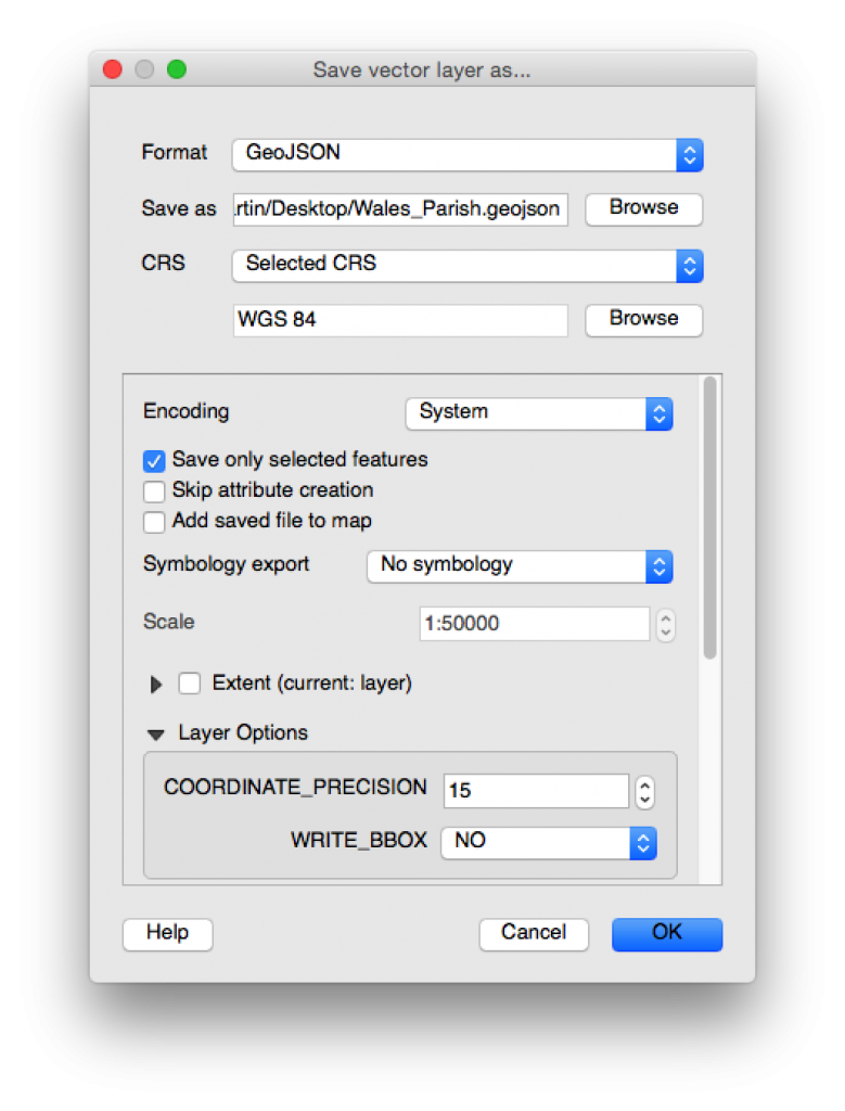
Now we can save this selection as geoJSON, which is a nicer format to work with than ESRI shapefiles, and will easily be handled by Leaflet. While we’re at it, we can convert the coordinates of the boundary data to WGS84 (which essentially gives us Lat,Lng coordinates we can use with our map):

Saving the selected parishes

Saving the selected parishes

For this example (because we’ve only had a response from Cardiff Council so far), we only need to deal with the Cardiff parishes, so for simplicity we’ll extract the Cardiff parishes from our large geoJSON file into a smaller Cardiff specific file. A quick bit of Python looking for all the parishes with a LAD14CD of ‘W06000015’ is all that’s needed here:

import json

parishes = json.load(open('Wales_Parish.geojson', 'r'))
cardiff_parishes = {'type': parishes['type'], 'crs': parishes['crs'], 'features': []}

for feature in parishes['features']:
 if feature['properties']['LAD14CD'] == 'W06000015':
 cardiff_parishes['features'].append(feature)

json.dump(cardiff_parishes, open('Cardiff_Parish.geojson', 'w'))

This geojson is all we need to display the parish boundaries on our map. In fact, if we edit the geojson file to include

var parishes = {ALL_OUR_GEOJSON_DATA}

We can import this directly into a webpage and load it into a map with leaflet relatively easily using the geoJson function in leaflet:

<!DOCTYPE html>
<html lang="en">
<head>
 <meta charset="UTF-8">
 <meta name="viewport" content="width=device-width, initial-scale=1.0, maximum-scale=1.0, user-scalable=no" />
 
 <title>Empty Properties</title>
 <link rel="stylesheet" href="http://cdn.leafletjs.com/leaflet/v0.7.7/leaflet.css" />
 
 <style>
 html, body, #map {
     height: 100%;
     width: 100%;
 }
 </style>
</head>
<body>
 <div id="map"></div>

 <script src="http://cdn.leafletjs.com/leaflet/v0.7.7/leaflet.js"></script>
 <script src="cardiff_parish.js"></script>
 <script>
   // create map and centre on Cardiff
   var map = L.map('map').setView([51.455, -3.19], 12);

   L.geoJson(parishes).addTo(map);

   // add some mapbox tiles
   var tileLayer = L.tileLayer('http://{s}.tiles.mapbox.com/v3/' + 'YOUR_MAPBOX_API_KEY' + '/{z}/{x}/{y}.png', { 
       attribution: 'Map data &copy; <a href="http://openstreetmap.org">OpenStreetMap</a> contributors, <a href="http://creativecommons.org/licenses/by-sa/2.0/">CC-BY-SA</a>, Imagery © <a href="http://mapbox.com">Mapbox</a>',
       maxZoom: 18
   }).addTo(map);
 </script>
</body>
</html>

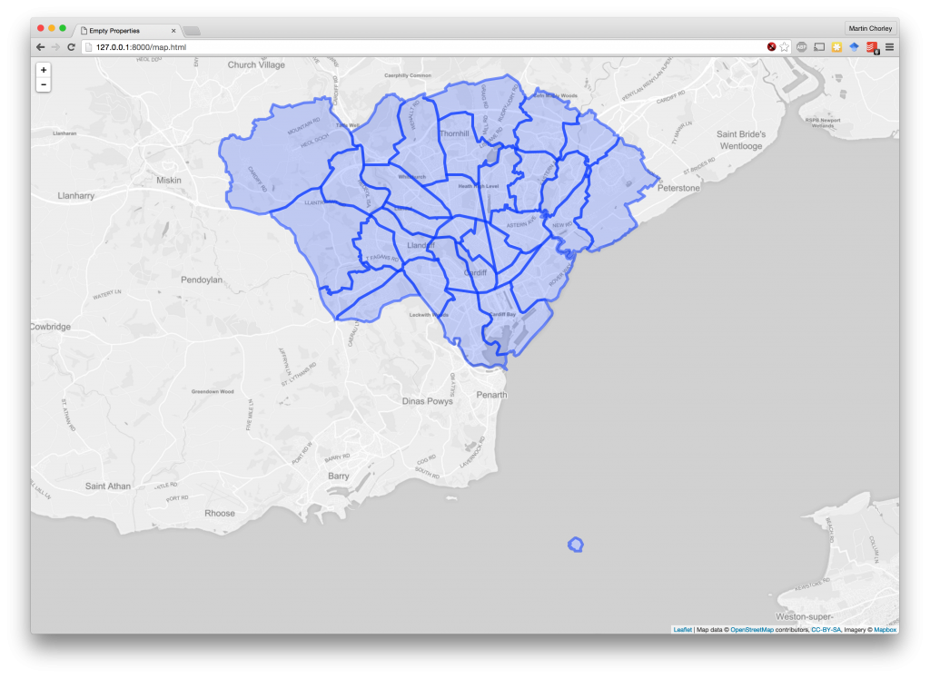
This gives us a nice map of Cardiff with the parish boundaries:

Cardiff parishes on a map

Cardiff parishes on a map

All we need to do now is alter the colour of our parishes based on the number of empty properties within that parish. So, we go back to the data we extracted preciously, which gave us the total number of empty properties in each parish. We can go back to our code that extracts the Cardiff parishes from the large geojson file, and this time whenever we extract a Cardiff parish, we add a property to the geoJson feature with its value from the empty properties data. We also add min and max values across the whole set of parishes:

import json
import pandas

parishes = json.load(open('Wales_Parish.geojson', 'r'))
cardiff_parishes = {'type': parishes['type'], 'crs': parishes['crs'], 'features': [], 'properties':{}}

parish_totals = pandas.read_csv('parish_totals.csv', index_col=0)

cardiff_parishes['properties']['min'] = parish_totals['value'].min()
cardiff_parishes['properties']['max'] = parish_totals['value'].max()

for feature in parishes['features']:
 if feature['properties']['LAD14CD'] == 'W06000015':
 
 parish_name = feature['properties']['PARNCP14NM'].strip().upper()
 feature['properties']['empty_total'] = parish_totals.loc[parish_name]['value']

 cardiff_parishes['features'].append(feature)
 
json.dump(cardiff_parishes, open('Cardiff_Parish.geojson', 'w'))

Then, we set up a colour scale in our JavaScript code for creating the map (based off a single-hue colorbrewer scale), and style each shape according to its value by adding a style function that gets called by Leaflet when it is drawing each geoJson feature:

<script>
 // create map and centre on Cardiff
 var map = L.map('map').setView([51.455, -3.19], 12);

 var divisor = parishes.properties.max / 9;
 var colour_scale = ["#fff7ec", "#fee8c8", "#fdd49e", "#fdbb84", "#fc8d59", "#ef6548", "#d7301f", "#b30000", "#7f0000"];

 L.geoJson(parishes, {
   style: function(feature){
     var colour = colour_scale[Math.round((feature.properties.empty_total/divisor)-1)];
     return {color: colour, fillOpacity: 0.4, weight: 2}
   }
 }).addTo(map);

 // add some mapbox tiles
 var tileLayer = L.tileLayer('http://{s}.tiles.mapbox.com/v3/' + 'YOUR_MAPBOX_API_KEY' + '/{z}/{x}/{y}.png', { attribution: 'Map data &copy; <a href="http://openstreetmap.org">OpenStreetMap</a> contributors, <a href="http://creativecommons.org/licenses/by-sa/2.0/">CC-BY-SA</a>, Imagery © <a href="http://mapbox.com">Mapbox</a>', maxZoom: 18 }).addTo(map); </script>

And with a refresh of our map page, there we have a choropleth of the parishes in Cardiff, coloured by the number of empty properties:

Choropleth of empty properties in Cardiff

Choropleth of empty properties in Cardiff

This is a nice quick example that has allowed us to begin thinking about mapping data, and some of the issues surrounding such mappings, before we begin to study them it in detail next semester. As more of the data is returned from our FOI requests, we can start expanding this visualisation across Wales.

Filed Under: Blog, Teaching, The Lab Tagged With: choropleth, coding, foi, leaflet.js, map, visualisation

Updating Empty Properties: Agate vs Pandas

5th November 2015 by Martin Chorley

In the lab session this week we looked again at the Freedom of Information act and considered a request to Cardiff Council for the list of empty properties in Cardiff. Last year we did a very similar session, but this year I carried out the simple data analysis slightly differently.

[Read more…]

Filed Under: Blog, Teaching, The Lab Tagged With: agate, coding, data, foi, pandas, python, tools

  • 1
  • 2
  • Next Page »

Copyright © 2023 · News Pro Theme on Genesis Framework · WordPress · Log in