Computational & Data Journalism @ Cardiff

Reporting. Building. Designing. Informing

  • Blog
  • About Us
  • Local
  • Guests
You are here: Home / Archives for visualisation

Visualising the Creative Industries in Cardiff: CUROP project

5th June 2017 by Martin Chorley

This summer, our team is running a project funded by the CUROP scheme here at Cardiff University. The Creative Cardiff team have collected a large amount of data on the creative industries in Cardiff, and are now looking for new ways to explore and communicate this data. Our summer project is aiming to do just that, bringing in an undergraduate student to gain some experience of the research environment, carry out some exploratory data analysis, and then design and implement visualisations to aid public understanding of the data.


Current mapping of Creative Cardiff data


We’ve just recruited our student, Samuel Jones, a first year student in the School of Computer Science and Informatics, and we’ll be getting started on the project soon. As we go, we’ll keep the site updated with progress, and point out the final outcomes once they’re released

Filed Under: Blog, Research Tagged With: creative cardiff, curop, data, map, student project, summer project, vis, visualisation

Sustainable Software Institute – Research Data Visualisation Workshop

1st August 2016 by Martin Chorley

Last week I gave a talk and delivered a hands on session at the Sustainable Software Institute’s ‘Research Data Visualisation Workshop‘ which was held at Manchester University. It was a really engaging event, with a lot of good discussion on the issues surrounding data visualisation.

Professor Jessie Kennedy from Edinburgh Napier University gave a great keynote looking at a some key design principles in visualisation, including a number of studies I hadn’t seen before but will definitely be including in my teaching in future.

I gave a talk on ‘Human Science Visualisation’ which really focused on a couple of key issues. Firstly, I tried to illustrate the importance of interactivity in complex visualisations. I then talked about how we as academic researchers need publish our interactive visualisations in posterity, and how we should press academic publishers to help us communicate our data to readers. Finally, I wanted to point people towards the excellent visualisation work being done by data journalists, and that the newsrooms are an excellent source of ideas and tips for data visualisation. The slides for my talk are here. It’s the first time I’ve spoken about visualisation outside of the classroom, and it was a really fun talk to give.

We also had two great talks from Dr Christina Bergmann and Dr Andy South, focusing on issues of biological visualisation and mapping respectively. All the talks generated some good discussion both in the room and online, which was fantastic to see.

In the afternoon I lead a hands on session looking at visualising data using d3. This was the first time I’d taught a session using d3 v4, which made things slightly interesting. I’m not fully up to speed with all the areas of the API that have changed, so getting the live coding right first time was a bit tricky, but I think I managed. Interestingly, I feel that the changes made to the .data(), .exit(), .enter(), update cycle as discussed in Mike’s “What Makes Software Good” make a lot more sense from a teaching perspective. The addition of .merge() in particular helps a great deal. As you might expect from a d3 workshop that lasted a mere three hours, I’m not entirely convinced that everybody ‘got’ it, but I think a most went away satisfied.

Overall it was a very successful workshop. Raniere Silva did an excellent job putting it together and running the day, and I really enjoyed it. I’m looking forward to seeing what other people thought about it too.

Filed Under: Blog, Research Tagged With: engagement, talks, vis, visualisation

Empty Properties: simple choropleth maps with leaflet.js

27th November 2015 by Martin Chorley

We’re still working on looking at empty properties around Wales, and so while we wait for the FOI request results to come in, I thought it would be interesting to do a bit of basic mapping. Normally, if I want to create a choropleth I reach straight for d3 and my collection of topojson, but we’re still very early in the course, and we haven’t covered d3 yet (we go into it in some detail in next semester’s visualisation course). As we haven’t covered d3 yet, we need a simple solution, and fortunately the leaflet API makes it very easy to draw polygons on top of a map; all we need to know are the coordinates of the shape that we want to draw.

So, first we need to grab boundary files for the parishes around Wales. A quick hunt through the bafflingly obtuse ONS geoportal brings us to the generalised parish boundaries (E+W). Although it doesn’t seem immediately obvious from that page, there is a download link there that allows us to obtain shapefiles containing the boundary data for every parish in England and Wales. Unfortunately, these files are in a rather complicated shapefile format, when all we really need is a list of coordinates that we can throw into some JavaScript. We could extract and transform this data using command line tools, but as this is an early demo, we’ll use some graphical tools to do the work. So, first of all we open up the shapefile in our favourite GIS software:

England + Wales Parish boundaries in QGIS

England + Wales Parish boundaries in QGIS

This is all the parishes for England and Wales, and we only want the boundaries for Wales, so the next thing we’ll do is extract those. Looking at the attribute table, we see that each parish has a code connecting it to it’s Local Authority District (the LAD14CD). Using a simple filter on the ‘LAD14CD’, we can extract all those parishes that are in a local authority district in Wales, by selecting only those LAD14CDs that begin with a ‘W’:

Filtering based on attributes - substr(LAD14CD, 0, 2) = 'W'

Filtering based on attributes

This gives us our Welsh parishes:

Welsh parishes selected

Welsh parishes selected

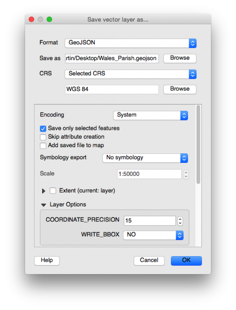
Now we can save this selection as geoJSON, which is a nicer format to work with than ESRI shapefiles, and will easily be handled by Leaflet. While we’re at it, we can convert the coordinates of the boundary data to WGS84 (which essentially gives us Lat,Lng coordinates we can use with our map):

Saving the selected parishes

Saving the selected parishes

For this example (because we’ve only had a response from Cardiff Council so far), we only need to deal with the Cardiff parishes, so for simplicity we’ll extract the Cardiff parishes from our large geoJSON file into a smaller Cardiff specific file. A quick bit of Python looking for all the parishes with a LAD14CD of ‘W06000015’ is all that’s needed here:

import json

parishes = json.load(open('Wales_Parish.geojson', 'r'))
cardiff_parishes = {'type': parishes['type'], 'crs': parishes['crs'], 'features': []}

for feature in parishes['features']:
 if feature['properties']['LAD14CD'] == 'W06000015':
 cardiff_parishes['features'].append(feature)

json.dump(cardiff_parishes, open('Cardiff_Parish.geojson', 'w'))

This geojson is all we need to display the parish boundaries on our map. In fact, if we edit the geojson file to include

var parishes = {ALL_OUR_GEOJSON_DATA}

We can import this directly into a webpage and load it into a map with leaflet relatively easily using the geoJson function in leaflet:

<!DOCTYPE html>
<html lang="en">
<head>
 <meta charset="UTF-8">
 <meta name="viewport" content="width=device-width, initial-scale=1.0, maximum-scale=1.0, user-scalable=no" />
 
 <title>Empty Properties</title>
 <link rel="stylesheet" href="http://cdn.leafletjs.com/leaflet/v0.7.7/leaflet.css" />
 
 <style>
 html, body, #map {
     height: 100%;
     width: 100%;
 }
 </style>
</head>
<body>
 <div id="map"></div>

 <script src="http://cdn.leafletjs.com/leaflet/v0.7.7/leaflet.js"></script>
 <script src="cardiff_parish.js"></script>
 <script>
   // create map and centre on Cardiff
   var map = L.map('map').setView([51.455, -3.19], 12);

   L.geoJson(parishes).addTo(map);

   // add some mapbox tiles
   var tileLayer = L.tileLayer('http://{s}.tiles.mapbox.com/v3/' + 'YOUR_MAPBOX_API_KEY' + '/{z}/{x}/{y}.png', { 
       attribution: 'Map data &copy; <a href="http://openstreetmap.org">OpenStreetMap</a> contributors, <a href="http://creativecommons.org/licenses/by-sa/2.0/">CC-BY-SA</a>, Imagery © <a href="http://mapbox.com">Mapbox</a>',
       maxZoom: 18
   }).addTo(map);
 </script>
</body>
</html>

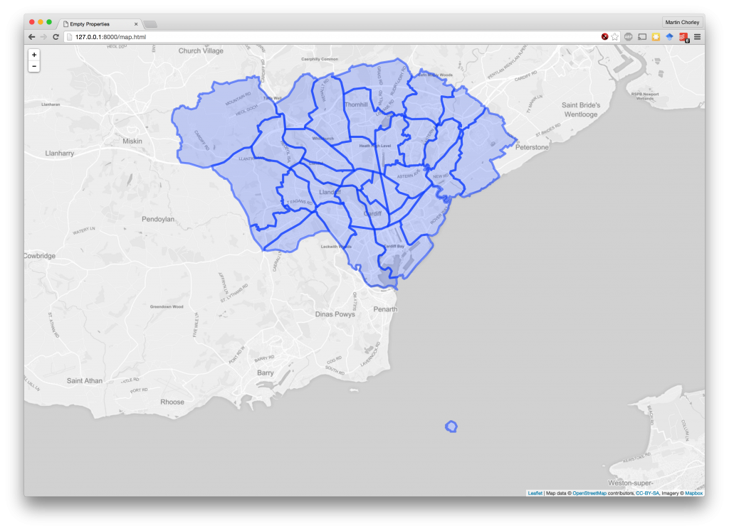
This gives us a nice map of Cardiff with the parish boundaries:

Cardiff parishes on a map

Cardiff parishes on a map

All we need to do now is alter the colour of our parishes based on the number of empty properties within that parish. So, we go back to the data we extracted preciously, which gave us the total number of empty properties in each parish. We can go back to our code that extracts the Cardiff parishes from the large geojson file, and this time whenever we extract a Cardiff parish, we add a property to the geoJson feature with its value from the empty properties data. We also add min and max values across the whole set of parishes:

import json
import pandas

parishes = json.load(open('Wales_Parish.geojson', 'r'))
cardiff_parishes = {'type': parishes['type'], 'crs': parishes['crs'], 'features': [], 'properties':{}}

parish_totals = pandas.read_csv('parish_totals.csv', index_col=0)

cardiff_parishes['properties']['min'] = parish_totals['value'].min()
cardiff_parishes['properties']['max'] = parish_totals['value'].max()

for feature in parishes['features']:
 if feature['properties']['LAD14CD'] == 'W06000015':
 
 parish_name = feature['properties']['PARNCP14NM'].strip().upper()
 feature['properties']['empty_total'] = parish_totals.loc[parish_name]['value']

 cardiff_parishes['features'].append(feature)
 
json.dump(cardiff_parishes, open('Cardiff_Parish.geojson', 'w'))

Then, we set up a colour scale in our JavaScript code for creating the map (based off a single-hue colorbrewer scale), and style each shape according to its value by adding a style function that gets called by Leaflet when it is drawing each geoJson feature:

<script>
 // create map and centre on Cardiff
 var map = L.map('map').setView([51.455, -3.19], 12);

 var divisor = parishes.properties.max / 9;
 var colour_scale = ["#fff7ec", "#fee8c8", "#fdd49e", "#fdbb84", "#fc8d59", "#ef6548", "#d7301f", "#b30000", "#7f0000"];

 L.geoJson(parishes, {
   style: function(feature){
     var colour = colour_scale[Math.round((feature.properties.empty_total/divisor)-1)];
     return {color: colour, fillOpacity: 0.4, weight: 2}
   }
 }).addTo(map);

 // add some mapbox tiles
 var tileLayer = L.tileLayer('http://{s}.tiles.mapbox.com/v3/' + 'YOUR_MAPBOX_API_KEY' + '/{z}/{x}/{y}.png', { attribution: 'Map data &copy; <a href="http://openstreetmap.org">OpenStreetMap</a> contributors, <a href="http://creativecommons.org/licenses/by-sa/2.0/">CC-BY-SA</a>, Imagery © <a href="http://mapbox.com">Mapbox</a>', maxZoom: 18 }).addTo(map); </script>

And with a refresh of our map page, there we have a choropleth of the parishes in Cardiff, coloured by the number of empty properties:

Choropleth of empty properties in Cardiff

Choropleth of empty properties in Cardiff

This is a nice quick example that has allowed us to begin thinking about mapping data, and some of the issues surrounding such mappings, before we begin to study them it in detail next semester. As more of the data is returned from our FOI requests, we can start expanding this visualisation across Wales.

Filed Under: Blog, Teaching, The Lab Tagged With: choropleth, coding, foi, leaflet.js, map, visualisation

NHS Hackday 2015

30th January 2015 by Martin Chorley

This weekend staff and students from the MSc in Computational Journalism took part in the Cardiff NHS Hackday 2015. Our liveblog of the event is here, and you can see our final product online, with all the code available in our GitHub repository.

We’ve created the foundation for a project (Health Explorer Wales) that can visualise all sorts of health related data across the local authorities and local health boards of Wales. We’ll look to improve this over the coming weeks, with the hope that it can find a community willing to adopt it and drive it forwards in the future.

Health Explorer Wales

Health Explorer Wales

I’ve written a fuller debrief of the event on my personal blog here, and photos from the event are included below. All pictures are released under a Creative Commons BY-NC 2.0 licence by Paul Clarke

This slideshow requires JavaScript.


Filed Under: Blog Tagged With: coding, hackday, msccompj, visualisation, web

Copyright © 2023 · News Pro Theme on Genesis Framework · WordPress · Log in